Regulation and competition within the insurance industry means that it is getting more and more difficult to find quality leads and grow your brokerage.
Many insurance brokers do not know where to start when it comes to optimising their online marketing and crafting the most effective mobile lead generation.
They don’t have a lot of skills marketing and they are also very busy with running their business. If this sounds familiar, you are likely looking for ways that you can improve your business and increase your leads.

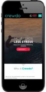
One of the most crucial aspects to making sure that your website is as effective as possible in generating leads is to ensure that it is optimised for mobile.
More people than ever are using their mobile devices as their primary way to surf the web, run businesses and do many tasks – including researching insurance.
According to the 2015 Communications Data Report by Ofcom, smartphones are responsible for a third of all Internet access. This is an increase from 23% in 2014. Two thirds of adults now have a smartphone and we spend a steadily growing amount of time on it every day.
However, as we enter 2017 smartphones are responsible for over 50% of all Internet access.
So, there is a very good chance that many people who are visiting your insurance website are looking for information.
The problem occurs when your insurance website isn’t suited to the small screen that your visitors are viewing it on.
If your website isn’t optimised for mobile, the potential customer will struggle to navigate the site and it will be challenging for them to read your information.
hey are likely to go and enquire about insurance from your competitor, whose website is easier to use on mobile.
Maybe you have been aware that your audience is increasingly using mobile, but perhaps you haven’t been prepared with the incredible velocity with which it has grown.
Another very important thing to know is that Google penalises your website if it is not optimised for mobile.
This means that it is more critical than ever for your website to be optimised for mobile. You can hire a professional to help you do this or if you have a bit of coding knowledge you can easily do it yourself.

Optimising Your Insurance Brokerage Website
In order for your insurance brokerage website to be optimised for mobile, it needs to be easily
readable on a small screen, forms formatted correctly, call-to-actions and links need to be easy to click on.
There should be no need to magnify the size or scroll horizontally.
Everything should be laid out in an easy to read way that makes the most of the small screen space.
The rule for any website is that it should be well organised and easy to understand, but this is even more important when the user is viewing it on a small screen.
On a small screen the design should be simple – no space should be wasted.
Also, because most mobile devices have a limited band-width, it shouldn’t load anything you don’t need.
Of course, these design qualities that value simplicity and efficiency should be present in any website – whether mobile or not. A well designed website does not have any unnecessary clutter and it loads quickly, presenting all of the important information in an easy to understand and accessible way.
Simple Steps for Website Optimisation
It’s not as hard as you might think to optimise your website for mobile.
There is a simple trick that you can use in CSS called “Media Queries.”
It can allow you to create responsive websites that will change their appearance according to the device that the website is being viewed on. This can be changed if you have access to the main CSS file of your blog.
If you are on WordPress, you can click on Appearance and then Editor and make sure that you see the words “Stylesheet” across your screen. The bottom of this file is where you will add the code.
The next step is to determine the criteria that you want to use for the mobile browser.
You can determine the maximum width.
This means that every device that accesses the site with a screen less than the determined amount of pixels wide will use the CSS that is specified within the brackets.
A good rule of thumb is to use 1020 pixels as the cutoff size for mobile.
Keep It Simple
Then, you will be stripping down the design of the site to make it better suited to mobile.
It shouldn’t be too wide – it should strike a balance between filling up the screen and being readable.
For example, you may want to put your content in a vertical line and then use the tag “width: auto” to allow this content to take up the width of the screen no matter what size the mobile device is.
You will also want to eliminate all of the extra features and visual bells and whistles that may not work on a small screen.
For example, sometimes social media sharing widgets don’t work on mobile devices, so you can choose to hide them instead.
Also, make sure that the text is at the right size so that it is easy to read on mobile. You may need to boost the font size for all of the text within your articles and web content.
Trial and Error
As you tweak the elements of the website, keep checking how it looks on mobile so that you can adjust it to your liking.
A quick tip to test this is on your desktop or laptop drag your screen edge in, reducing the viewing size and assess how your website is optimised for all screen sizes including tablets.

It might take a few rounds of tweaks until you get it looking and functioning correctly on a small screen.
If you are unfamiliar with code, you can always ask a web designer to help you with this part. Even if you end up paying a professional to optimise your site for mobile, the increase in leads will be worth the investment.
At the moment, more potential customers than ever are using mobile to search for insurance services. If your website isn’t optimised, you are missing out on their business plain and simple.